|
S&P 500 - some serious trends here
|
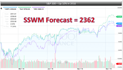
Chart for January, 2018 - Forecast
|
S&P 500 - one more for the road?
|
Chart for Sunday December 17th - Markets
|
A Walter Becker Year - is there gas in the car?
|
Chart for Sunday March 19th - Markets
|
Rates & Inflation - gas pedal or anti-lock brake?
|
Source: U.S Department of Treasury, AAII
Chart for Sunday March 12th - Oil
|
Oil's slippery slope
|
Source: Bloomberg, Trading Economics, Fiscal Times
Chart for Sunday March 5th - Markets
|
He keeps Tweeting, Markets keep climbing. Running out of gas?
|
Source: Yahoo!, Business Insider, New York Times
Chart for Sunday January 29th - Markets
|
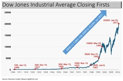
How impressive is the Dow 20K? Not as impressive as the steepness of how we got here.
|
Chart for Sunday January 1st, 2016 - Markets
|
Source: Yahoo! Finance
|
New Year, New Forecasts
Drivers: lower tax rates, deregulation, inflation, strengthening economy, growth in Financials & Energy. Risks: strong USD, higher interest rates, Trump policies.
|
Chart for Sunday September 25th - Education
|
Source: Business Insider
|
Not Good When Graduates Owe More Than They Earn
|
Chart for Sunday August 14th - Housing
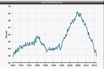
Home Ownership at Lowest Levels, Housing Prices Reaching Highs - signaling a Bubble?
- Americans who own a home fell to 62.9% in 2Q16, matching 1965 for the lowest reading on record.
- Labor market performing pretty well, housing fairly valued and credit conditions gradually improving, the latest reading should mark the floor.
- Long term plan = more people are choosing to rent instead of buy.
- Millennials - homeownership among people aged 18-34 fell to 34.1% from 34.8%, one of the largest drops across age groups.
- The decrease could be just as likely due to new renter household formation as it is their ability to buy homes.
- Low affordability in the entry-level segment, right where millennials are looking.
- Homeownership rose in just one category: among 35-44 year olds.
- Homes may have been foreclosed on during the financial crisis, or chose not to buy a home, and are only now entering the market.
- To move the needle (18 months) <> slowly rising incomes, easier credit conditions, and a steady economy.
- Home prices set an all-time high in June, eclipsing the previous peak set nearly a decade ago.
- Record may make homeowners feel house rich, rate of appreciation in many markets may point to a bubble that's close to bursting.
- Median home price rose 6% month over month and 9% year over year in June (2016) to $231,000.
- Highest level since July 2005, when the median price reached $228,000 before the last housing downturn and subsequent recession.
- Thirty-nine of the tracked 130 metropolitan markets also hit fresh highs in the month.
- Homeowners who managed through the downturn have regained the value lost.
- In certain markets, prices have risen between 30 and 50% percent in four years.
- Affordability of housing in these markets, with rapid appreciation, have buyers priced out.
- Brooklyn, San Francisco, Denver, Portland and Austin.
- Decline in the share of all-cash buyers to the lowest level since the fourth quarter of 2007.
- Mortgages backed by the FHA, a good proxy for first-time buyers, was down year over year.
- Number of FHA buyers jumped last year after FHA insurance premiums were lowered, but that was short-lived.
- Low interest rates have kept many of the markets affordable, but once prices climb out of reach (and rates rise), many areas could experience a painful pullback.
- Prices may go down year over in some appreciated areas, but these will not be an increasing part of the market.
- What do you think? Is housing healthy, is it sustainable?
Chart for Sunday August 7th - Markets
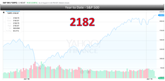
Can You Believe Your Eyes?
- Bull market will continue with comparable risks. Could get choppy.
- Manufacturing remains sluggish and 2Q growth was disappointing.
- The Fed noted the seemingly improving environment, but remained noncommittal as to future action.
- Earnings season has been largely better than expected, supports the recent rally but caution remains.
- Apparent decoupling between oil, which entered bear market territory after the recent fall, and stock prices.
- Lower oil prices should help to bolster consumers, and thus stock prices.
- Volatility has declined, but likely won’t stay this low.
- Level of relative asset appreciation may be cause for concern.
- Housing market looks healthy.
- Wage gains are starting to take hold.
- Fed remains on hold, but keeps potential for a rate hike on the table.
- Analyst’s earnings outlook for the global stock market continues to improve.
- Waters will get choppy, we see more upside from the recent record of 2,182.
Chart for Sunday March 27th - Oil
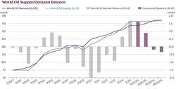
Oil Has Hit Bottom - will the stock market stabilize and move upward?
- Crude oil prices have staged a strong comeback - rising close to 58% in the past 5 weeks.
- Prices are still down about 58% from the pre-crash level in June 2014.
- The Crash is nearing an end.
- Oil production outside the OPEC cartel may be slowed under the weight of lower prices.
- Demand is forecasted to increase by 1.6 million barrels per day in 2016.
- The supply & demand imbalance in the oil markets is likely to change in 2016.
- Demand growth should erode the majority of the surplus - end of the decline in the price of oil is here.
- The recovery will be painful and slow.
- Drilling activity will remain dormant until 2017.
- Watch for oil to move up to $40 per barrel and continue the upward trend through 2016.
- Supply & Demand will start to balance out - market reaction should be positive.
Chart for Sunday March 13th - Retirement
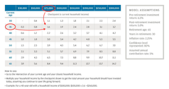
Can People Actually Afford to Retire - how you doin'?
Source: JP Morgan Asset Management
- You know you have to do it - save.
- So how much should you have by now?
- Grab the Chart to the left.
- Find your age (closest) on the left side.
- Find your current salary on the top.
- Find the box where they both intersect.
- Multiply that number by your current salary.
- Example: 35 years old; make $75,000 per year; = 1.6x; you should have $120,000 saved.
- Assumptions are: 5% salary contribution per year; retire at 65 years old; live to 95.
- You behind, ahead, or in denial?
Source: JP Morgan Asset Management
Chart for Sunday February 28th - Markets
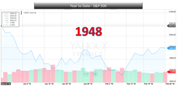
What a Start to 2016 - Bull Market still alive?
- Consensus remains that the drawdown in stocks is a normal correction - no economic recession
- Top equity strategists see the S&P 500 ending the year above 2,000.
- 2,000 = Bank of America Merrill Lynch - tight regulatory environment hampering growth.
- 2,000 = JPMorgan - volatility causes technical damage to market psychology hurts business & consumer sentiment.
- 2,050 = Credit Suisse - US growth more problematic than we hoped for.
- 2,050 = Societe Generale - equities continue to react to bad news (tight financial conditions, rate hikes).
- 2,100 = Stifel - enormous deflationary impulse in the world. World currencies in focus.
- 2,100 = BMO Capital Markets - bumpy path fixated on the perceived negative implications of China/oil, credit spreads and the Fed.
- 2,100 = Goldman Sachs - S&P 500 index will tread water for a second consecutive year in 2016.
- 2100 to 2,150 = RW Baird - multiple expansion in the market overall and using a 17.5 — 18x multiple.
- 2,150 = BNP Paribas - markets impacted by the pace of hikes and impact of stock prices on consumer confidence and corporate investment.
- 2,150 = Citi - Energy, expected to continue to reduce 2016 S&P 500 EPS forecast.
- 2,175 = Morgan Stanley - investor confidence, US economy and corporate behaviors the key to meaningful acceleration path.
- 2,175 = UBS - China equity market and FX instability, a renewed oil price plunge, the Fed made a policy error by hiking in December? - US economic data will continue to drive direction.
- 2,180 = Jeffries - recent decline in 10 year rates will be supportive for equities, equity risk premium is still high.
- 2,200 = Barclays - U.S. interest rates will go up leading to a stronger U.S. dollar, earnings per share growth and returns to remain subdued, forecast 4% EPS growth and a 5% gain for the S&P 500.
- 2,200 = Deutsche Bank - expect 5%+ move in the S&P and soon. Not panicked by correction.
- 2,225 = RBC Capital Markets - oil weighing on markets, earnings wil be soft.
- 2,300 = Oppenheimer - oil will bottom, market oversold realization, dollar will find resistance.
- 2,325 = Fundstrat - US growth strengthens, EM stabilizes and Eurozone further firms, US growth should improve on heels of better consumer income.
- 2,045 = Sua Sponte Wealth Management - because we really have no clue, but happy with 5%.
- Oil and interest rates matter most at this point.
Chart for Sunday January 24th - Markets
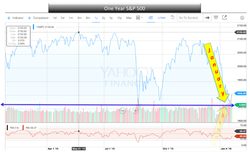
Bad January - strong 2016?
- The S&P 500 closed 2015 at 2,043, in January 2016 it has dropped as much as 11% (so far).
- The S&P 500 is currently on pace to record its worst monthly decline since January 2009 and 11th worst month.
- Will this prove to be just a blip in a long-term secular bull market?
- Following its 20 worst months, on average, performance tends to snap back rather sharply.
- The average gain for the S&P 500 during the 3/6/12-months following the 20 worst months is roughly 3%, 7%, and 15%, respectively.
- The index has almost never recorded a loss during these subsequent months.
- As a result, this is one data point that reinforces S&P 500 levels could rise by double-digits in percentage terms from current levels between now and year-end.
- Now is not the time to dump stocks?
- Corrections are part and parcel of the investment process - ups and downs - volatility.
- Build Wealth - time in the market, not timing the market.
Chart for Sunday January 17th, 2016 - Oil
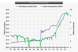
Speculation - always at the heart of a bubble?
- Significant correlation between the Federal Reserve's balance sheet and the increase in US oil production.
- Oil and gas production and exploration was — for many US shale producers — at heart a speculative investment.
- With interest rates low and investors starved for returns, money poured into shale oil production.
- Oil prices remained near $100 a barrel for several years following the financial crisis.
- Now, oil is near $30 a barrel, an 11 or 12-year low.
- US and international production also remains near record highs.
- Crude oil inventories are also near multi-decade highs and the US oil rig count has collapsed.
- Production, however, continues near record levels.
- The Fed's balance sheet is heavy, over $3 trillion spent to help the economy recover from the financial crisis.
- Where did all that cheap money go? Not to the students.
- Oil and gas producers, and every other speculator, took advantage of all that cheap money.
- Who's next? Same thing happen with stocks?
Chart for Sunday December 13th - Oil
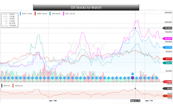
Oil is the best indication of Global Growth?
- What a challenge to trade in this oil market - how low will it go?
- The Saudis will play the waiting game - watch it - perfect plan execution.
- Goal - destroy the non-OPEC production and regain global market control.
- What price per barrel will it take to tighten the noose, $45?
- They will drive the price lower than $35 a barrel to cause the largest US companies into major restructuring.
- Prices will go lower, and stay low, until we see major shake outs via bankruptcies.
- Oil prices and oils stocks will be in for another 12 to 18 months of depressed, and tight, action.
- Pick those stocks that you feel will be the survivors and play those cautiously - not much more downside?
- Those that are down over 50% to 70% from 2014 highs will likely be casualties.
- The oil patch is a brutal playground, but for those with stamina and nerves of steel, rewards ahead.
Chart for Sunday October 25th - Markets
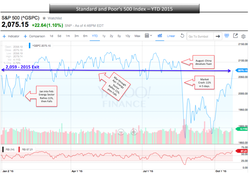
One wrong turn and you are right back where you started
- The Standard and Poor's 500 is up almost 10% from its September low of 1,887.
- The index closed at 2,075 on Friday, just above the 2,059 starting point for 2015.
- Outstanding return of 0% for the year.
- The S&P 500 has been on a six-year bull run, it has NEVER been up for seven consecutive years.
- October - S&P up 7.8% for the month, the sixth best October EVER for the index.
- Wild ride: China unexpectedly devalues its currency.
- Stocks crash, Dow falls more than 1,000 points in one day.
- Federal Reserve decides to delay interest rate hikes.
- Volkswagen emissions cheating scandal hits.
- Glencore shares plunge - viability of mining operations is questioned.
- Bad September US payroll report.
- Russia involvement in Syria.
- Do you see a final run to 2,350 for the S&P?
Chart(s) for Sunday September 6th - Markets
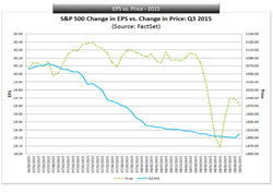
Waiting for value - Bull Run without Earnings is like a paycheck without working
- During the past year (four quarters), the average decline in the bottom-up EPS estimate during the first two months of the quarter has been 4.1%.
- During the past five years (20 quarters), the average decline in the bottom-up EPS estimate during the first two months of the quarter has been 2.5%.
- During the past 10 years (40 quarters), the average decline in the bottom-up EPS estimate during the first two months of the quarter has been 3.4%.
- Thus, the decline in the bottom-up EPS estimate recorded during the course of the first two months of the third quarter was lower than the one-year average and the 10-year average, but slightly above the five-year average.
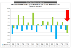
- The value of the S&P 500 also declined during the first two months of the third quarter.
- From June 30 through August 31, the value of the index decreased by 4.4% (to 1972.18 from 2063.11).
- This marked the first time since Q4 2012 that both the bottom-up EPS estimate and the value of the index fell during the first two months of a quarter.
- During the first two months of the previous 10 quarters (Q1'13-Q2'15), the value of the index increased while the bottom-up EPS estimate for the quarter decreased.
- At the sector level, nine of the 10 sectors recorded a decline in the bottom-up EPS estimate for the first two months of the third quarter, led by the Materials (-7.9%), Industrials (-6.6%), and Energy (-6.3%) sectors.
- These three sectors also witnessed the largest declines in value over the first two months of the quarter.
- The Energy (-12.1%) and Materials (-10.5%) sectors were the only two sectors to record double-digit declines in value over the first two months of the quarter.
- The Industrials sector was tied with the Health Care sector for the third largest decline in value over this time frame at -5.5%.
- Long run value - stock prices and earnings revert to long term averages - ride out short term swings.
- Short term - big gamble if trading on the expectation they will align in a rational manner.
Chart for Sunday August 30th - Terms
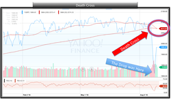
Bulls, Bears, Dead Cat Bounce - Death Cross? Oh this market we love.
- A "Death Cross" occurs when an index or stock's 50-day moving average falls below its 200-day moving average.
- Often seen as a reversal in the prevailing long-term trend for a security.
- S&P 500 has only experienced a "Death Cross" 10 times.
- While returns over the next month have only been positive 20% of the time.
- Average returns over the month following a "Death Cross" coming out to -1.38%.
- Over the next six months, things look pretty good.
- 90% of the time, returns for the S&P 500 have been positive six months after a 'Death Cross'.
- Average return clocking in at 8.23%, more than double the average six-month return for the index (3.47%).
- Only time the index has been lower - was following the October 2000 period when the Dot Com bubble burst.
- The volatile conditions we've seen will persist.
- Expect more sharp moves lower in the near term, so be prepared for them.
- Exit positions, on upswings instead of downswings, keep the market's long-term trajectory upward in mind.
Chart for Sunday August 23rd - Markets & The Fed
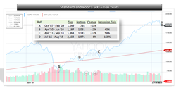
Oh what a difference a day makes. Markets pull back hard. Has anything really changed?
- In two days, US stocks tumbled far enough to log the worst week since September 2011.
- Dow on Friday lost more than 500 points and entered into a correction – 10% drop from recent highs.
- The S&P 500 closed down 5% for the week, lost more than 100 pts in a week - first time since 2008.
- Looked like we had everything we needed for the Federal Reserve to tighten monetary policy.
- Markets had been climbing higher and taking economic data releases in stride.
- July unemployment report looked satisfactory.
- Consumer spending seemed to be picking up as most retailers report increases in same store sales.
- Global Central Banks are keeping a tight hold on interest rates in order to support their economies.
- Lower energy prices are keeping inflation in check. Fed goal is 2%.
- We do have low current wage growth and there does appear to be slack in the labor market.
- Federal Open Market Committee (FOMC) eluded to an accelerating economy, just not fast enough to raise rates.
- On Friday, West Texas Intermediate crude oil fell below $40 per barrel for the first time since 2009.
- Brace for extreme choppiness up to the Fed meeting in September.
- Play the market information to your advantage, we see no rate hike in September, it just told us so.
- Pull back could be 15% to 17% before it is over, Fed to hold on rates, markets to recover into Q4.
- Stay educated and stay invested. If you can't handle the waves, head for the beach.
- Sua Sponte.
Chart for Sunday August 16th - Stocks
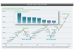
How can these markets not worry you? Blackrock's most recent reminder of what is important.
- Everything is in play, where is this economy going? Rising interest rates, crashing oil prices, strong dollar, weak earnings.
- Greece, China, Puerto Rico, who's next?
- Are we at the top, should we sell, should we buy and not miss the next run?
- Markets are getting spasmodic.
- Watch the headlines for an opportunity to benefit from bad news, watch your portfolio for what really matters.
- Diversify - the most important way to manage portfolio risk overall is to diversity.
- Diversify across stocks, bonds, geographic regions and sectors.
- Try minimum volatility - ETFs might be a good fit . Track market indexes with a mix of historically less volatile stocks.
- Bargain shop. Stocks are expensive today, when the market drops, it can be a great buying opportunity.
- Stay the course - make no sudden moves, markets tend to balance out, staying invested in a diversified portfolio.
- Use headlines to your advantage (what has really changed?)
- Stay educated and stay invested.
- Did you ride any roller coasters this summer? Sua Sponte
| blackrock_must_read.pdf | |
| File Size: | 2565 kb |
| File Type: | |
Chart for Sunday August 9th - Housing
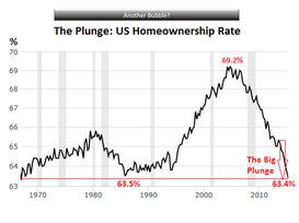
Why are housing prices soaring yet home ownership plunging?
- Housing prices are soaring, it is a sellers market.
- Nationwide, the median price of existing homes, at $236,400, 2.7% higher than July 2006.
- In many cities, the median price today is far higher, than it was during the prior housing bubble.
- A buying panic has set in.
- Even while real incomes have stagnated or declined for all but the top earners.
- The Fed has succeeded in pumping up nearly all asset prices to achieve its “wealth effect.”
- Despite the the soaring prices, overall home ownership is plunging.
- Home ownership rate dropped to 63.4% in Q2, down 1.3% from a year ago <> lowest since 1967.
- The plunge in home ownership rates has spread across all age groups, but to differing degrees.
- Younger households have been hit the hardest.
- In the age group under 35, the home ownership rate in Q2 saw a slight uptick to 34.8%, from the dismal record low of 34.6% in the prior quarter.
- The 35-year and under group is where the first-time buyers are concentrated; and they’re being sidelined, whether they have no interest in buying, or simply don’t make enough money to buy.
- Rental vacancy rate dropped to 6.8%, from 7.5% a year ago, the lowest since 1985.
- America is turning into a country of renters.
- As people abandon the idea of owning a home, they turn into renters, and the rental market tightens up, and vacancy rates decline.
- Since 2012, private equity firms bought several hundred thousand vacant single-family homes in key markets, drove up prices in the process, and started to rent them out.
- Thousands of smaller investors have jumped into the fray, buying homes, driving up prices, and trying to rent them out.
- Result - record median home price across the country, huge price increases in some key markets.
- Rents have jumped. the median asking rent in the US rose 6.2% from a year ago, and 17.6% since 2011.
- All at a time when incomes, wages and inflation have remained relatively flat.
- Risk - people who can’t afford to pay the rising rents with their stagnant or declining incomes borrow the money to make up the difference and then spend even more on consumer goods.
- Brace for the next storm?
Chart for Sunday July 26th - Markets
What is with this market?
Source: Yahoo
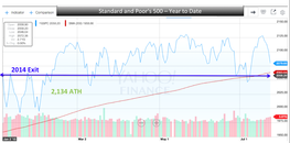
- July got of to a rocky start as the S&P dipped below its 200 day moving average, first time since Oct 2014.
- Greek crisis and a drop in the Chinese stock market of 35% was sure to trigger a 10% plus sell-off in US Markets, did not.
- S&P 500 closed at 2,079.65, 2.55% from its all time high, .78% from the 200 day moving average, 1.04% from 2015 start.
- This month, S&P 500 moved close to the all time high on May 21st - 2,130.82.
- Ongoing volatility, but not much can derail this market.
- Look for a 5% to 7% run in the second half of 2015.
Source: Yahoo
Chart for Sunday June 21st - The Fed
Interest rate anticipation, got you seeing dots?
- FOMC - Federal Open Market Committee.
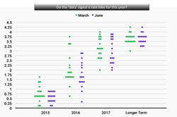
- Dot Plot - shows where each participant feels the federal funds rate should be at the end of the year, and longer.
- Not an official tool, but provides a view of how the members feel about future economic/monetary conditions.
- Plot shows all 17 members expect the rate should be <1% for the end of 2015; median between .5% & .75%.
- Current information would indicate that a rate hike is in the dots for later this year.
- June FOMC 'plot' shows a larger than anticipated downward projection for the fed funds rate at the end of 2015.
- Chart created to compare the dots over the March (green) and June (purple) meetings. Downward.
Chart for Sunday June 14th - Economy
Could the rapid rise in job openings be good news for wages?
- Measuring job openings, layoffs, and turnovers offer huge clues on where wages are going.
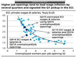
- Graph - relationship between the number of unemployed people per job opening and a broad and reliable measure of wages and other employee compensation.
- Job openings have been increasing and the number of unemployed people has been decreasing.
- Potentially leading to wage inflation, signs of which showed up in the Q1 ECI.
- ECI = (Employment Cost Index.
- The horizontal axis of the chart shows the quarterly average number of unemployed workers per job opening.
- As you go to the left on that axis, fewer potential applicants for each opening, indicating a tighter labor market.
- The vertical axis shows the year over year percent change in the ECI private wages and salaries measure, two quarters after the job opening data.
Chart for Sunday June 7th - Markets
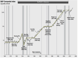
What does the Market look like to Warren Buffet on any given day?
Source: Business Insider
- S&P 500 closed at 2,093 on Friday, just 2% off the 52 week high.
- Been a great ride if you have kept your head down, remained calm, and stuck to your plan.
- October 2008, dark days, Warren Buffett tells the country to stay calm.
- Bad news, as tough as it is to take, is the investor's friend - "buy a slice of the future at a discount".
- Since Buffett made those comments, the S&P fell another 20%, now back to near all time high.
- Market madness - be patient, the trend is up long term.
Source: Business Insider
Chart for Sunday May 24th - Economy
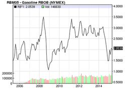
What happens when low oil prices fail to ignite the Economy?
- Experts anticipated that low oil prices would boost the economy.
- It appears that the economy actually shrunk in CYQ1 of this year.
- It may have barely grown in the entire first half of 2015 due to sharp cuts in energy.
- Savings at the gas pump did not spur consumer spending elsewhere - spending slowed.
- At $2.74 a gallon, the average price of gas nationwide is nearly $1 lower than it was a year ago.
- In January, the average briefly reached $2.03, the lowest in five years.
- Corporate spending on drill rigs, steel piping for wells and railcars to transport oil has become an increasingly vital driver of economic growth.
- As a result, when oil prices fall and energy companies retrench, the economy suffers.
- The drilling boom that erupted in 2008 made the United States the world's largest combined producer of oil and natural gas.
- Energy production contributes about 2% to economic output, up from less than 1% in 2000.
- Consumers remain reluctant to spend freely.
- Americans are less likely to spend extra money if they think the gain is temporary.
- Consumer spending rose at an annual rate of just 1.9% in the first quarter, compared with the previous quarter's 4.4%.
- Energy's breakneck growth was thrown into reverse by a 50% drop in oil prices from June to January.
- Price decline, rapid pullback in drilling - ripple effect throughout other industries.
- Goldman Sachs estimates that three jobs will be lost in other industries for every position shed by energy companies as laid-off workers spend less.
- Not what we had expected.
Chart for Sunday April 26th - Stocks
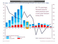
Follow the P/E Ratio? Take a Minute to Understand this Chart.
- Standard and Poor's PE Ratio = the price of the S&P divided by expected earnings of those companies.
- When the forward PE is above average, the market is expensive and future returns will be low.
- When the PE ratio is below average, the market is cheap and future returns will be high.
- The tallest bar - the stock market has spent most months (61) since 1988 at 15x.
- This happens to be right around the long-term average.
- When the PE is above 15, people often say the market is expensive.
- The blue bars (light blue bars, blue bars), and the red bars indicate certain levels of 12-month returns.
- Heights of the darker blue bars - 10%+ returns occur more frequently when you invest when the PE is lower.
- There are certainly not unheard of at higher PE levels.
- Black Line - average returns - the lower the PE, the higher your future returns tend to be.
- Current forward PE ratio - 17.1 - 4.23.15 closing price (2112.93) and forward EPS estimate ($123.83).
- A bit on the high side, the history since 1988 shows that 12-month returns have always been positive.
- Also true at 16x and 18x earnings: forward returns have always been positive over a one-year horizon.
- At 17x earnings, the average forward 12-month return is 13%, ranging from 0% to 31%.
- Based on this data, 17x forward earnings is not expensive.
- You buying, selling or holding at this level?
Chart for Sunday March 29th - Markets
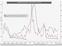
VIX goes Lower, Stocks go Higher?
- Swings in stock prices are bound to get smaller as the economy nears its sixth full year of expansion.
- Chart shows the relationship between volatility in the Standard & Poor’s 500 Index and year-to-year changes in the growth rate for U.S. gross domestic product.
- The S&P 500 indicator is based on price changes for the previous 60 days of trading.
- The S&P 500 volatility surpassed 15 percent this month for the first time since August 2012.
- The VIX (Volatility Index) ended last week at 13.02, its low for the year.
- The CBOE gauge, known as the VIX, reflects prices of options on the index.
- Volatility moves with the economic cycle, drifting lower as the expansion matures.
- This pattern will hold up because there’s little risk of recession.
- The current period of growth started in June 2009, according to the National Bureau of Economic Research.
- The prospect of the Federal Reserve ending more than six years of near-zero interest rates doesn’t change the equation.
- The VIX dropped between June 2004 and June 2006, a period in which the central bank increased the target rate for overnight bank loans 17 times.
- Lower VIX readings bode well for U.S. stocks.
- A 7% decline in the option-based indicator coincided with a 1% advance for the S&P 500 on average since 2000.
Chart for Sunday March 15th - Currency
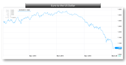
The Dollar is Strong
- The euro continued its crumble last week - currently 1.0483 on Sunday 07:45pm EDT.
- Less than a week ago, it was above $1.10.
- Just 12 months ago, the euro reached an 18-month high against the dollar, at nearly $1.40.
- It has plunged 22.5% since then.
- The rapid decline of the euro is raising questions - when will the Dollar = the Euro?
- They have not been one for one since 2002.
- Look for the two currencies to reach parity in 2015.
- Many forecasters started the year with a $1.15 forecast for the euro at the end of the 2015.
- European Central Bank's new quantitative-easing program should tend to weaken the euro.
- Federal Reserve's likely rate hikes should strengthen the US currency.
- Investments made in dollars can get a better return through higher interest rates, demand for dollars goes up, and so does the currency strengthen against others.
- In the next couple of years the ECB will keep monetary policy loose.
- The Fed will be looking to raise rates steadily.
- This makes parity between the euro and dollar a real possibility.
Chart for Sunday March 8th - Markets
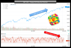
Happy Birthday, is the party over?
- It's been six years since the the S&P 500 hit an intraday low of 666.79 on March 6, 2009.
- The S&P 500 opened on Friday at 2,100.91, a remarkable 215% gain.
- S&P 500 just off its all-time high of 2,119.59 (Feb. 25).
- Only three [bull markets] since World War II have lasted this long.
- Earnings per share growth will be key - this year's 7.7% rise is consistent with the long-term average for year six.
- Earnings per share growth was 11% in year seven.
- Interest rates remain accommodative with the yield on the 10-year note currently below the average of 4.7% at year six - making the yield curve the steepest it's ever been at this point in the cycle.
- The rule of 20, which sums the P/E with the CPI is currently below 19 versus 22 at bull market tops since 1948, implying that stocks are not overpriced.
- Eat some cake, ignore prior observations and proceed with caution.
Chart for Sunday - February 22nd - Debt
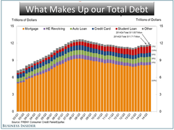
Will we set new records?
- Household debt grew to $11.83 trillion in the fourth quarter of 2014.
- Household debt in the third quarter rose 1.0%, or by $117 billion.
- Household debt is below its $12.68 trillion peak reached in the third quarter of 2008.
- Mortgages balances, the largest component of household debt, increased by 0.5%.
- Mortgage balances stand at $8.17 trillion, up by $39 billion from their level in the third quarter.
- Home equity lines of credit (HELOC) declined slightly, by $2 billion (0.4%) in the fourth quarter
- HELOC now stand at $510 billion.
- Non-housing debt balances increased by 2.6 %, with increases in all categories of debt.
- Auto loan balances increased by $21 billion; student loan balances increased by $31 billion; credit card balances increased by $20 billion.
- Student loan debt as something worth watching.
- Student loan delinquencies and repayment problems appear to be reducing borrowers’ ability to form their own households.
- Originations, which we measure as appearances of new mortgage balances on consumer credit reports and which includes refinanced mortgages, increased slightly, to $355 billion, but remain low by historical standards.
- About 122,000 individuals had a new foreclosure notation added to their credit reports between October 1 and December 31.
- Mortgage delinquencies improved, with the share of mortgage balances 90 or more days delinquent decreasing slightly; 3.1% of mortgage balances were 90+ days delinquent during 2014Q4, compared to 3.2% in the previous quarter.
- Outstanding student loan balances reported on credit reports increased to $1.16 trillion (+$31 billion) as of December 31, 2014, representing about $77 billion increase from one year ago.
- Student loan delinquency rates worsened in the 4th quarter. About 11.3% of aggregate student loan debt is 90+ days delinquent or in default in 2014Q4, up from 11.1% in the third quarter.
- Auto loan delinquency rates worsened. The 90+ days delinquency rate is now at 3.5%, up from 3.1% in the previous quarter.
- The number of credit inquiries within six months – an indicator of consumer credit demand – increased by 4 million from the previous quarter, to 175 million.
Chart for Sunday - January 11th, 2015 - Markets
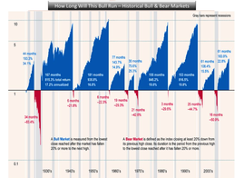
Based on History, this Bull Market is no Big Deal
- S&P 500 is up an extraordinary 212% from its March 2009 low of 666.
- This bull market has been running for 68 months, which seems like a long time.
- Historically, the length length and strength of this bull run isn't that big a deal.
- The blue illustrates past bull markets' durations and returns (total and annualized).
- The red illustrates the bear markets. (Note: this was published in May).
- There's a lot more blue than red, stocks have spent more time going up than down.
- The y-axis = the multiple up or down from the beginning of each bull and bear market.
- The amount by which the stock market can fall is limited to 100%.
- Market crashes are scary, but you usually lose less than 100% of your investment.
- The amount by which it can go up is unlimited.
- Shorting the market can be a very scary process.
- You can make more than 100% of your initial investment if you're long.
- Oh boy those declines are painful.
Chart for Sunday - January 4th, 2015 - Markets
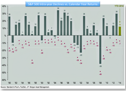
Big Sell-offs - we hate them, but we need them
- Despite intra-year drops of 14.2%, annual returns are positive in 26 of 34 years.
- Sell-offs happen all the time, get used to it. Revisit this slide often.
- 2014 saw two violent sell-offs that were tough to handle.
- #1 S&P 500 - tumbled 9.8% from 2,019 on 9.19.14 to 1,820 on 10.15.14.
- #2 S&P 500 - dropped 5.1% from 2,079 on 12.5.14 to 1,972 on 12.16.14.
- Each time the Market recovered, with gains.
- These unnerving sell-offs occur during years when markets head higher.
- Even the crash of 1987, Black Monday, was part of a bull market.
- Never a reason to panic, stay cool, they may be big. See them as opportunity. Look for value.
Chart for Sunday - December 14th - Markets
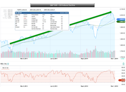
Is Oil's Slide a Market Buying Opportunity?
- Oil prices are at or near a 5-year low, may hurt energy companies, it helps nearly everyone else.
- Q4 earnings and GDP estimates are still quite strong.
- Equity valuations are not overly cheap nor overly expensive, but they are fair.
- The dollar is rising because the economy is strong, not because inflation is rising.
- The 4-week moving average of weekly jobless claims remains near an 8-year low.
- The unemployment rate is at a 6½ year low.
- The labor participation rate has not fallen for the last 7 months.
- Inflation at 1.7% is a level that has historically been bullish for equities.
- Fed will not raise interest rates until late January at the very earliest; more likely April or June.
- Global monetary policy (outside the US) remains very accommodative.
- Very little is expected from Congress until the newly elected seats are filled in January.
- Compared to the -7.5% pullback in October, the current pullback (<3% so far) is relatively small.
- Markets seem to be over-reacting to lower energy prices, even though they are net positive overall.
- Sharp drops in oil prices could spark fears of bankruptcies, production cuts, and even layoffs in the domestic energy sector.
- Equity & bond prices are sharply falling again in Greece, which could spark Eurozone contagion fears similar to those that rattled equity markets in the fall of 2011.
- Domestic interest rates are falling again and are very close to the lows reached in mid-October.
- The 12/17 FOMC meeting could result in the removal of the “considerable time” language, which opens the door to interest rate increases in 2015, and that could spook the markets.
- Economic struggles in Europe and emerging markets, combined with higher global market volatility, could spark investor concerns of spillover into the US.
- The continually strengthening dollar could hurt foreign companies with dollar denominated debt, many of whom may not have hedged their currency exposure.
- Debt defaults could hurt US banks that lent to them.
- Oil prices do not seem to be finding any support yet.
Chart for Sunday - December 7th - Debt
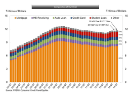
Not a Good Trend
- Household debt rose to $11.71 trillion in the third quarter.
- Household debt in the Q3 rose 0.7%, or $78 billion, to $11.71 trillion, up from $11.62 trillion.
- Household debt is below its $12.68 trillion peak reached in the third quarter of 2008.
- Led by increases in auto loans, student loans and credit card balances, steadily trended upward.
- It appears that the deleveraging period has come to an end and households are borrowing more.
- Mortgage debt rose by $35 billion, or 0.4%, to $8.13 trillion in the third quarter.
- Student loan debt rose by $8 billion in the third quarter to $1.13 trillion.
- About 11.1% of aggregate student loan debt is more than 90 days delinquent or in default.
- Auto loan balances rose by $29 billion - delinquency rate on auto debt fell to 3.1% from 3.3% last quarter.
- Home equity lines of credit declined by $9 billion, or 1.7%, in the third quarter to $512 billion.
- Non-housing debt balances increased by 1.7% in the third quarter.
- Overall delinquency rates were roughly flat in the third quarter, with 6.3% of all outstanding debt in some stage of delinquency compared to 6.2% in the second quarter.
Chart for Sunday - November 23rd - Energy
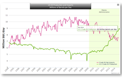
Back on Top - never would have expected that
- Oil has trumped the S&P as 2014's biggest financial news story.
- Crude oil prices have fallen by more than 30% from this years highs.
- Unites States crude oil production has been exploding.
- Can not deny that increased production has resulted in lower prices.
- US oil production is expected to increase further by 1 mmb/d in 2015.
- Expect continued increase in production to 0.6-0.7 mmb/d per year in the years to 2020.
- Domestic production now exceeds imports.
- Fascinating to watched as minimal cost of production is estimated at $73/bbl.
Chart for Sunday - November 9th - Markets
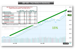
Midterm elections over - market rally continues?
- Statistics show that stocks typically rally in the months following a midterm election.
- Republicans now control the senate, the Presidency remains Democratic.
- Ugly gridlock could be bullish for the markets and should present a great launch into 2015.
- S&P 500 rose 15.1% on average since 1941 when Congress controlled the same party with president a Democrat.
- 7% on average between November and April.
- Uncertainty is removed, seen as good news, then focus is back on earnings for remainder of year.
- History would say 15% increase for the upcoming 2015 calendar year.
Chart for Sunday - November 2nd - Wealth
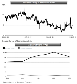
Savings - who needs it, who can afford it?
- People who live in an unequal economy consume less.
- GDP is 70% consumer consumption.
- Income is now more concentrated in the hands of the rich.
- Rich tend to save and invest higher proportions of their earnings than other classes.
- That equates to less spending and less demand across the economy for a given level of income.
- Income and wealth should increase over the course of your lifetime.
- Average 65 year-old has had more years to save.
- But not all the inequality is boomers acquiring more assets than before.
- 1989 - average senior had 9x more wealth than a young adult.
- 2013 - average senior had 18x more wealth.
- Why? - student debt, gyrations in housing market, Americans must now finance own retirement.
- Economic growth requires both trickle-up and trickle-down.
Chart for Sunday - October 19th - Markets
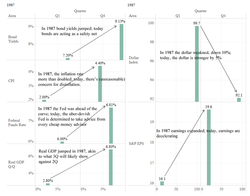
Correction - can we find similarities to 1987?
- 1987 - Stock value declined by 31% even-though GDP showed growth and earnings were accelerating.
- Bonds - 1987 yield jumped from 7.2% to 9.1%; today bond yields are falling.
- Inflation - 1987 inflation doubled from 2% to 4%; today we run the risk of disinflation or deflation.
- Federal Funds Rate - 1987 the Fed raised from 6% to 6.8%; today Fed considering QE4 rates at 0.25%.
- Real GDP - 1987 Real GDP expanded quickly, from 2.8% to 6.8% (Q/Q annualized rate).
- Real GDP - today Real GDP looking like it accelerated in Q3 over Q2, this after the strong recovery in GDP in Q2 compared to Q1.
- Dollar - the dollar depreciated quickly in 1987, dropping 10% against major trading partners.
- Dollar - today is acting as a safe-haven currency in today’s environment, with the currency up around 5% against its major trading partners since bottoming last earlier this month.
- Earnings - 1987 earnings continued to expand, going from $16.1 to $19.6, even though stocks were down 31%.
- Earnings - today earnings are weakening, with the most recent Q3 estimate at 4% Y/Y growth ($113), down significantly from the $118 in Q2.
Chart for Sunday - October 5th - Earnings
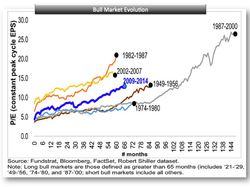
Fed Aside, it's all about Earnings
- Markets correlate with the direction of earnings.
- Earnings and expectations for future earnings are what drive stock prices in the long run.
- Investors pay a premium for those earnings, which fluctuate over time through profit cycles.
- This Premium is most commonly measured by the price-earnings ratio.
- P/E ratio movement during Bull Markets, by Tom Lee, is the ratio of price divided by peak earnings level of the cycle.
- Key: Chart reflects a moving price (P) and a static peak level of earnings (E).
- Shows how high P/Es will get and how long it takes for stocks to get to that peak.
- Historical patterns provide a precedent for what could be many more years of gains in the stock market.
- Tom Lee sees S&P 500 earnings peaking at $154 from the $118 level of today.
- Chart: current bull market P/E using implied peak earnings of $154 vs. the prior long lived bull markets.
- S&P 500 is currently 12.9x ($154 peak) and prior bulls peaked at an average of 17x.
- Applying the 17x average to the $154 estimated peak earnings = a peak S&P 500 value of 2600.
Chart for Sunday - September 28th - Interest Rates
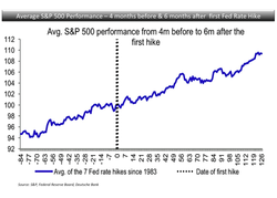
Fed generated Turbulence means Opportunity?
- Higher interest rates are coming.
- Investor concern - higher rates mean higher borrowing costs - bad for profits, maybe for stocks.
- Stocks typically sell-off on the first of a series of rate hikes.
- The magnitude and duration of the sell-off depend on conditions:
- During early cycle hikes the initial sell-off was generally small.
- Quickly recovered.
- Further S&P gains came in next three months and longer (like 2004, 1983, 1972).
- But many sell- offs on late cycle hikes became corrections or even bear markets.
- It's only in hindsight do we know where we are in the cycle.
- Measures - Shape of the curve, inflation measures, years since the last recession.
- 2015 is likely another mid-cycle year - do not expect a severe S&P reaction to hikes.
- Risk - the Fed hikes too late or too little - inflation accelerates - hike to levels higher than expected.
- Chart: avg price move of the S&P 500 during the four months before and the six months after the first rate hike - average of the last seven hikes.
- General direction of the stock market tends to be up.
Chart for Sunday - September 21st - Economy
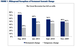
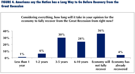
Americans and the Great Recession - Part Two
- Recession has brought about permanent changes to the economy.
- Changes include: affordability of college, age of ability to retire, job security, retirees working part time.
- The workplace will become less attractive in the years to come.
- Mismatch between jobs and skills.
- Workers will take jobs below their skill level.
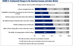
- Only 20% of those employed today are confident of finding another job if laid off.
- Economy continues to grow and add jobs, Americans' very concerned about the economic future.
Source: Worktrends, JLH Center for Workforce Development, August, 2014.
Chart for Sunday - September 14th - Interest Rates
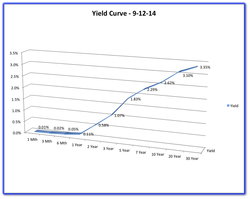
Waiting on the Fed
- Federal Reserve may give guidance, this week, on when it will raise the cost of borrowing.
- Fasten your seat belts, the shot will be heard around the world.
- The US, and the Globe, is waiting for an indication on the first rate hike in over eight years.
- By the end of the year, 10-year Treasury rates will likely be running around 2.8%.
- A bit shy of the 3% rate we had been expecting, based on the strengthening economy.
- When a move by the Fed is imminent, long-term rates may jump by as much as half a %.
- Similar nervousness jolted rates higher in mid-2013, when Fed scaled back its monthly bond-buying.
- Anxiety about interest rates will fade as investors absorb the initial adjustment.
- By the end of 2015, figure on a federal funds rate of about 0.75%.
- Long-term Treasuries running in the neighborhood of 3.5%.
- Rates for 30-year fixed-rate mortgages will follow suit. Now around 4.1%.
- Rates will edge slowly toward 4.4% by the end of this year.
- Then they’ll follow the Treasury bond rate’s upward move in early 2015.
- Thirty-year home loans should end 2015 at around 5.1%, still low by historical standards.
Chart for Sunday - September 7th - Consumer Finances
|
|
Changes in US Family Finances
|
Chart for Sunday - August 31st - Economy
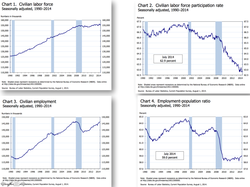
Americans and the Great Recession - Part One
- Over the past four years, nearly 10 million private-sector jobs were added back to the economy.
- More than 2.5 million jobs were added in the past year alone.
- The United States has experienced 53 straight months of economic growth
- The longest period of consistent job growth on record.
- The official unemployment rate is 80 percent back to pre-recession levels.
- Short-term unemployed — people out of work for less than six months — already returned to pre-recession levels.
- As of July 2014, nearly 9.7 million workers were unemployed.
- Many of the jobs lost during the Great Recession were high- and middle-wage jobs.
- Most of the recovery’s employment growth has been in low-wage occupations.
- Wages have increased modestly for many, not increased sufficiently to keep up with inflation.
- Labor force participation rates are at the lowest levels in three decades.
- Long-term unemployment rates remain at unprecedented high levels
- There are not nearly enough jobs for the new workers who are joining the labor force.
- Not enough jobs for millions who are either unemployed or part time, but seeking full-time work.
- The economy needs at least another seven million jobs to return to full employment.
- Declining unemployment is also due to the large number of workers who quit looking for jobs.
- 17% + (one in six men) — 10 million workers — are either unemployed or no longer looking for work.
- In 2014, more than 7.5 million individuals are working part time but prefer full-time jobs.
Chart(s) for Sunday - August 24th - Economy
|
The Economy is sputtering, why?
|
|
|
Chart for Sunday - August 17th - High Cost of Education
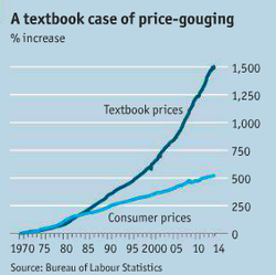
Have you bought your books yet?
- Not taking economics this semester? Your book store visit will be a lesson in economics 101.
- Textbook rates have grown at 15x since 1970.
- This is more than three times the rate of inflation.
- Professors have little incentive to choose inexpensive books, often choose ones they authored.
- Textbooks are a huge cash cow. TINA - there is no alternative.
- Students should look for foreign editions, often 90% cheaper.
- Try rent & return options.
- Digital books are cheaper, but can not be resold.
- Library? Anyone still go to the library?
Chart(s) for Sunday - August 3rd - Behavioral Finance
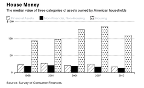
- Research released this week shows the typical household Net Worth is 1/3 less.
- Median wealth declined more than 35% from 2001 to 2013.
- Inflation-adjusted net worth for the typical household was $87,992 in 2003.
- It was only $56,335, or a 36 percent decline, in 2013.
- Wealth for the 95th percentile grew 14%.
- Reinforces and demonstrates how vulnerable the average American is to swings in housing.
- Baseline 2001, American's invest in housing and take on increased debt.
- Neglected is diversification into equities, fixed income and non-financial assets.
- Median real estate asset values increase 38% with the housing bubble.
- Median value of financial assets such as checking accounts, 401(k)s, stocks, and bonds dropped 9% from 2001 to 2007.
- During this time the S&P 500-stock index was up more than 20%.
- Non-financial assets value — cars, jewelry, business ownership—also fell by 18%.
- Painful - real estate became a disproportionate percent of household wealth.
- Chasing - people bought more or used perceived real estate equity to take on more debt.
- Housing bubble bursts - median wealth falls almost 40%, never fully recovered.
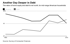
- Leveraged households took on increasing amounts of debt.
- Chart Two - shows the ratio of home equity (value minus debt) to net worth and the ratio of debt to net worth for American households between the 25th and 75th percentiles of wealth.
- Home equity increased, but debt increased even more.
- Overleveraged, underwater households, trend is at the heart of ever widening wealth inequality.
- Richer households have a much larger share of their portfolios invested in financial markets.
- The wealthiest 10%, 1/2 of their portfolios is invested in financial assets, 35% real estate.
- The middle 50% of households, real estate made up 67% of their wealth even after the housing bubble—four times the proportion of financial assets.
- Financial markets have recovered, wealthy households have gotten wealthier; housing has recovered more slowly, leaving middle-income households lagging behind.
- The average household is still overexposed to real estate.
- Widening inequality, and Americans are still vulnerable to a single market.
- Investment professionals do not recommend concentrating so much wealth in a single, highly leveraged asset.
| pfeffer-danziger-schoeni_wealth-levels.pdf | |
| File Size: | 5702 kb |
| File Type: | |
Chart for Sunday - July 20th - Economy (Inversion)
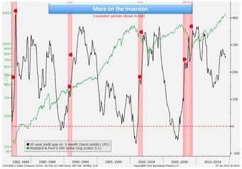
- The Fed might be years away from bringing an end to the current bull market in stocks.
- Shown is the Gap in yield between 10-year Treasury notes and three-month bills with the performance of the U.S. economy and the Standard & Poor’s 500 Index.
- Stocks consistently dropped around the time of “yield curve inversions.”
- Inversions occur when the 3-month yield exceeds the 10-year yield.
- Typically because of changes in Fed policy.
- Projections are that the next one may occur in 2017 at the earliest, based on interest-rate forecasts of the Fed’s voting members.
- The best indicator for the start of a bear market may still be a long way from signaling cause for concern.
- When the Fed starts to lift rates matters less than how much the cost of money rises.
- Possible first-quarter increase to the central bank’s benchmark rate.
- Equity investors should focus on the shape of the yield curve - not the target rate.
Chart for Sunday - July 13th - Economy
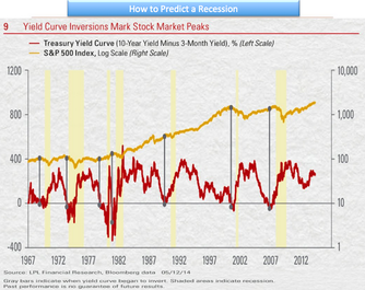 (please click to enlarge)
- One way to predict a recession without a false positive.
- Yield Curve - A line that plots the interest rates, at a set point in time, of bonds having equal credit quality, but differing maturity dates.
- The yield curve inverted just prior to every U.S. recession in the past 50 years. 7 for 7.
- Look for the yield curve inversion about 12 months before the start of the recession.
- Lead time may range from about 5 to 16 months.
- The peak in the stock market comes around the time of the yield curve inversion.
- Ahead of the recession and accompanying downturn in corporate profits.
- The Fed - been signaling that tighter monetary policy is on its way.
- Short-term interest rates should move higher.
- How far the Fed must push up short-term rates before the yield curve inverts by 0.5% depends on where long-term rates are.
- For long-term rates stay at the very low yield of 2.6% seen in mid-June 2014.
- To invert the yield curve by 0.5% the Fed would need to hike short-term rates from around zero to more than 3%.
- Based on the latest survey of current Fed members that vote on rate hikes, they do not expect to raise rates above 3% until sometime in 2017.
- Lots of economic and market factors drive what happens with interest rates.
- The shape of the yield curve is definitely worth paying attention to.
- Indicator for the start of a bear market may still be a long way from signaling a cause for concern.
- On this date: 13 Week at .0150; 10 Year at 2.52 <> (2.52-.0150)= 2.51+.5=3.01short term hike to invert the curve.
Chart for Sunday - June 22nd - Interest Rates
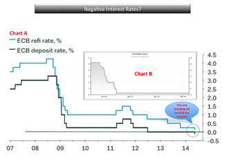 (click to enlarge)
- The ECB (European Central Bank), beginning of June, took interest rates into negative territory.
- ECB President Mario Draghi (6.5.2014) decided to take its deposit rate into negative territory, to -0.10%.
- First time a major central bank has cut any interest rate below zero.
- This means that any bank reserves held at the ECB will be charged 10 basis points, or 0.10%.
- Goal is to discourage hoarding and encourage money to be used for some form of investment.
- Intention: penalize for parking their reserves at the ECB, encourage lending out that money, spur economic activity.
- Drag on banking industry's earnings should be minimal - current low usage of the central bank's deposit facility.
- Direct effect of a negative deposit rate may be muted.
- Penalty for holding money in a bank is new territory for the financial industry.
- US interest rates, while slightly positive, remain at record lows.
Chart for Sunday - May 11th - Earnings
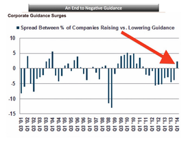 (click to enlarge)
- Earnings reports are almost complete.
- S&P Q114 earnings expected to rise 3.4% - good, but still down from the 8% in Q413.
- Better-than-expected earnings tends to be the norm this season.
- Analysts & investors had been slashing their expectations for earnings, the bar was set low.
- Chart would indicate that the unusually negative trend in earnings guidance may be ending.
- Ten quarters in a row, companies have provided cautious forward business projections.
- The “negative guidance spread” (more companies lowering guidance than raising it) has ended.
- Guidance spread has finally flipped positive.
- The % of companies raising guidance outnumbering the % lowering guidance by 2.3 points.
- Bullish? Many macro indicators signaling a pickup in growth - no signs of a recession.
Chart(s) for Sunday - May 4th - Unemployment
 (click to enlarge)
Do you need to dig deeper to get the true view of U.S. employment?
- By all views, the April jobs report beat expectations by adding 288,000 jobs.
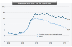
- The unemployment rate declined from 6.7% in March to 6.3% in April.
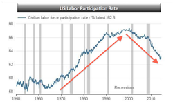
- Much of this improvement is due to the labor force participation rate (LFPR).
- The LFPR fell to 62.8% in April from 63.2% in March.
- The participation rate is at the lowest levels since 1978.
- Factors include an aging baby boomer workforce and younger workers enrolling in school.
 (click to enlarge)
- The reported unemployment rate vastly understates the weakness in the current economy.
- If 'missing' workers were actually looking for work, the unemployment rate would be 9.9%.
- Missing = due to weak job opportunities, neither employed nor actively seeking employment.
- The number of employed individuals actually fell by 73,000.
- The labor force actually contracted by 806,000.
- No demand when: work hours don't go up, & part-time [hours] for economic reasons don't go down.
- Was the decline in the unemployment rate due to expiration of unemployment benefits?
- Trend - downward unemployment rate, lower participation rate, stagnant wage growth.
- No pressure on the Fed to tighten, as slack remains in the job market, keeping wage pressure down.
- Investors - could mean easy money may be around for a long time.
- Unemployment rate is not just about job creation; it's also about fewer people looking for work.
- Yields on the 10-year note hit a five-month low on Friday.
- 30-year note's yield fell to its lowest since June.
- Watch treasuries for the true indication of a healthy workforce and recovering economy.
Chart for Sunday - April 27th - Behavioral Finance
 (click to enlarge)
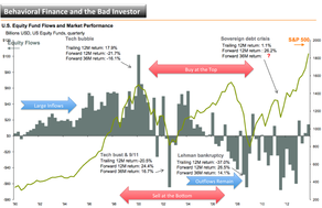
Mind over matter, can you exploit the market driven anomalies?
- Fundamental value (of a security) drives price long term.
- Logic would identify future cash flows and discount back to present value.
- Sentiment, or consumer confidence, and perception drives pricing short term.
- Intent would be to buy low and sell high. Behavioral finance shows we react differently.
- Emotional response to a market decline is, "I've lost as much as I can, I'm out."
- Diversify in order to have more consistent performance over time.
- S&P from 1991 to 2012 avg. return was 8.8% - avg. investor return was 3.49%.
- Prozac for your portfolio - lower highs and higher lows. Smooth out over time.
Chart for Sunday - April 20th - Wealth
 (click to enlarge)
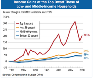
As the rich get richer, is it possible to build wealth from the ground up?
- Track your progress - make a goal and take small incremental steps. Adjust your strategy.
- Develop a positive mindset. Learn from, & respect, those who have gone before. Get a mentor.
- Diversification- silver quarter in 1964 bought a gallon of gas, equivalent buys a gallon today.
- Negotiate - never stop. Demand value in every purchase and endeavor. Increase earnings.
- Avoid impulse buying. Research & analysis in everything you do. Have no remorse, no regrets.
- Live below your means, keep a steady job, have a side project for supplemental earnings.
- Make a hobby out of learning ways to earn additional income. Seek out earnings sources.
- Do what's important to you. Not what's important to your neighbors, in-laws or co-workers.
- Stop making decisions based on - because it's "normal" and "what people do."
- Monitor your spending. Equate to your priorities. Don't waste assets. Prioritization is key.
- Boost your human capital. Skills, certifications, credentials = increased marketability & earnings.
- Your potential is your largest asset.
Chart for Sunday - April 13th - Growth
 (click to enlarge)
Stress, anxiety, volatility - the markets? No, your workplace
- Projections that earnings will rise much faster than sales may be too optimistic.
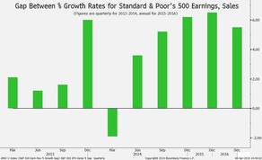
- This chart displays the projected percentage gaps between profit and revenue growth.
- Data is for companies in the S&P 500 Index through 2016 - analysts’ estimates.
- Quarterly figures for last year are included for comparison.
- Look for S&P 500’s first-quarter earnings to increase 1%, or 1.9% less than sales.
- Projection is profit to lead by 3.6 points in Q2, 5.2 points in Q3 & 6.2 points Q4.
- Companies will have to increase profit margins to records to meet estimates.
- The result is a scenario we view with ongoing skepticism.
- Margin for U.S. companies during last year’s fourth quarter was the highest since 1950.
- Earnings for the period amounted to 12.7 percent of sales.
- Expectation for ongoing ways to reduce costs and make workers more productive.
- Many companies lack the pricing power to bolster revenue.
- Forecasts for earnings growth must be pared to allow companies to satisfy investor expectations.
- Translation - cost reductions, more productivity out of less, increased market volatility.
Chart for Sunday - April 6th - Stocks
 (click to enlarge)
Up, down, volatility, back where we all began
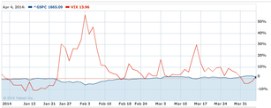
- S&P starts Q2 at about the same level we finished at in 2013.
- Both the S&P 500 and the VIX (volatility of the S&P) are close to unchanged.
- Despite setting new highs during the quarter, expect the choppiness to continue.
- Expect increased volatility as the indexes move higher in Q2.
- Facebook Inc, has fallen nearly 22% from an intraday record reached less than a month ago.
- Momentum stocks may see continued rotations out as investors seek growth alternatives.
- Begs to question if rotation will lead to contagion in other sectors.
- For momentum stocks to work, you need people to believe they can go higher.
- Those shares with high multiples will see most dramatic volatility.
- Momentum to the upside is slower, dramatic and accelerated momentum to the downside.
- Q1 S&P 500 companies' earnings are projected to have increased just 1.2% from a year ago.
- The forecast is down sharply from the start of the year, when growth was estimated at 6.5%.
- Look for compelling reasons for stocks to move higher in value.
- Company guidance is always key.
Chart for Sunday - March 16th - Value
 (click to enlarge)
Value should dictate the way we view the world
- Stock returns depend on valuations, not earnings, as investors hold them for shorter periods.
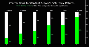
- Chart shows changes in P/E and EPS affect on S&P 500 performance.
- Short Term Results - changes in P/Es drive returns.
- Long Term Results - dictated by earnings growth.
- 2013 - 30% gain in S&P 500 supports this conclusion.
- S&P index climbed to 15.1 times projected earnings from 12.6 times during the year.
- Profit rose only 6%.
- Shifts in the P/E ratios contributed 82% of the index’s average move for three-month periods.
- The proportion dropped to 59% for one year, 41% for five years and 16% for 10 years.
- The S&P 500 may rise to 17 times predicted earnings from the current 15.4 times.
- Possible convergence between the index’s earnings yield, the inverse of its P/E ratio, and yields on corporate bonds.
Chart(s) for Sunday - March 9th - Earnings
Train Kepta' Rollin'
|
|
Chart for Sunday - March 2nd - Stocks
 Shiller PE Ratio (click to enlarge)
Not 1999, but a repeat of 2007?
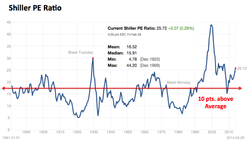
- The S&P 500 was valued at 25.72 times profit as of Feb. 28.
- The latest reading matched its level at the end of January,
- Which was the highest since December 2007.
- The month-end average since 1900 is 16.52 times profit.
- Earnings are substantially above the average.
- Using a figure that’s more in keeping with profit trends would put the CAPE ratio at 34x earnings.
- If the gap between actual and trend earnings closes in the next seven years, the S&P 500 would generate an average annual return after inflation of negative 3.2 percent for the period.
- The Shiller PE ratio for the S&P 500 is based on average inflation-adjusted earnings from the previous 10 years.
- It is also know as the the Cyclically Adjusted PE Ratio (CAPE Ratio), Shiller PE Ratio or the P/E10.
- The CAPE utilizes earnings from the prior 10 years.
- The numerator is the real value of the S&P 500.
- Real meaning adjusted for inflation.
- The denominator is the moving average of the preceding 10 years of the S&P 500 real reported earnings.
Chart for Sunday - February 23rd - Stocks
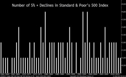 (click to enlarge)
Slump or One and Done?
- Equities may not see a recurrence of this year’s slump throughout the rest of 2014.
- Our chart shows the number of times that the S&P 500 Index declined 5 percent or more.
- In 22 of the 54 years, only one retreat crossed the threshold.
- Another 22 had two losses of that size.
- This year, the S&P 500 closed at a record on January 15th.
- Then dropped 5.8 percent through Feb. 3rd.
- The size of the loss approached an average of 7 percent for the index’s dips since 1957.
- Losses like the latest one usually stay under 10 percent and are quick.
- The S&P 500 reached its low in 12 trading days, less than half the average of 28 days since 1957.
- Uncertainty remains around which way stocks will go in the next 5 percent-plus swing.
- Higher oil prices are encouraging.
- Crude recently settled at more than $100 a barrel for the first time this year.
- Rising 9 percent from a low set last month.
- Economic strength remains uncertain.
- Weakness in U.S. employment and manufacturing continues.
- During January, fewer jobs were added than economists predicted.
- A manufacturing index from the Institute for Supply Management matched its biggest one-month drop in the economy’s current expansion.
- Despite that, the S&P 500 has risen 3 percent over the past three weeks.
Chart for Sunday - January 26th - M&A
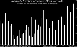 (click to enlarge)
Lucky Enough to be a Takeover Target, expect to get a premium.
- Mergers and acquisitions are poised to accelerate as companies increasingly use deals to solidify their industry standing.
- Buyers are willing to pay historically high prices for takeovers.
- This quarter’s average percentage gap between the value of offers and the market price of targeted companies exceeds the quarterly record.
- Buyers are willing to pay historically high prices for takeovers.
- This quarter’s average percentage gap between the value of offers and the market price of targeted companies exceeds the quarterly record.
- Suitors offered an average premium of 33.1 percent in the $99.3 billion of proposals made through January 21st.
- The highest figure for a full quarter is 31.5 percent, recorded during the first three months of last year.
- Less robust economic growth in many developed economies will prompt companies to protect market share through deals, rather than investing for expansion.
- Availability of cash and lower-cost financing may spur deal making.
- Industrial companies in the S&P 500 Index held $1.25 trillion of cash as of Sept. 30.
- U.S. Treasuries maturing in the next three years yield less than 1.7 percent, last year’s increase in consumer prices excluding food and energy (inflation).
- U.S. banks, insurers and technology companies are among potential targets.
- Japanese companies are poised to pursue overseas takeovers to counter a falling yen.
- The Japanese currency has declined 25 percent against the dollar since September 2012.
Chart for Sunday - January 12th - Earnings
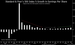 (click to enlarge)
Come on, punch it.
- We hope corporations have accelerated strong earnings growth in order to extend the market run.
- This chart shows year-to-year percentage changes in quarterly earnings per share for the S&P 500.
- Projection: after climbing 6 percent this quarter, S&P 500 profit will rise 10 percent in the second quarter, 11 percent in the third and 14 percent in the fourth.
- GDP will expand 2.9 percent worldwide this year, up from 2.3 percent last year and 2.8 percent in the U.S., up from 1.9 percent.
- S&P 500 companies will deliver combined earnings of $120 a share this year.
- Chart would indicate the S&P 500 will rise 12 percent this year to 2,075.
- SSWM is projecting 2,000.
Chart for Sunday - January 5th, 2014 - Stocks
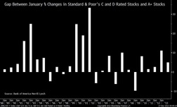 (click to enlarge)
The worst could be the best?
- Shares of companies with the worst performance on earnings and dividends could beat peers in Jan.
- Chart tracks performance gap between stocks with lowest S&P rating & highest rating.
- S&P classifies companies as A+, A, A-, B+, B, B-, C or D, based on profit & payout in the past decade.
- The chart illustrates how C and D shares fared relative to A+ stocks in January (historical).
- Through the first 11 months of 2013, C and D stocks led by about 17 percentage point.
- They came out ahead by more than 10 points in nine full years between 1987 and 2012.
- Did better in the following January every time.
- Based on the data, anticipate a low quality rally this month.
- C and D stocks surpassed their A+ peers by an average of 6.5 points for the month in the past 25 years.
- Stocks on the two lowest rungs of S&P’s quality scale have performed better in January than those on the top level for the last five years.
- The streak is the longest since 1994.
Chart for Sunday - December 29th - Economy
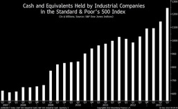 (click to enlarge)
If Things are Getting Better, why add so much cash?
- Companies added more cash in Q3 than at any other time in the U.S. economy’s current expansion.
- A strategy to guard against slowing growth.
- Cash and securities held by companies in the S&P 500 Index climbed during the quarter by $102B.
- This represents an 8.9% increase.
- Highest levels since the second quarter of 2009, when the most recent U.S. recession ended.
- The increase brought their cash on hand as of Sept. 30 to $1.25 trillion, the fifth straight quarterly record.
- That represents a ton of money that companies could put to work and are choosing not to.
- While Boeing Co., 3M Co. and others have raised dividends and increased stock-buyback plans.
- Confidence is lacking in the economy and consumer spending they need to invest in their business.
- If, and when, these companies decide to spend it will move markets and spur growth.
Chart for Sunday - December 22nd - Energy
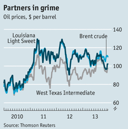
Oil - not all barrels are created equal
- Crude oil varies by viscosity, color and sulphurousness.
- 100 benchmark grades trade around the world everyday.
- West Texas Intermediary (WTI) - American focus ($98).
- Brent - from the North Sea - World focus ($109).
- Louisiana Light Sweet (LLS) - benchmark for Gulf refiners.
- Contracts for WTI are settled in Cushing, Oklahoma. Pipeline hub.
- Shale oil boom caused bottleneck in Cushing storage tanks - price sank. Variance hit $29.
- Release of the Cushing (light) bottleneck has created another blockage at refineries.
- Gulf refineries were designed to process heavier, more sulphurous grades from the Middle East.
- West and East Coast refineries could take more home-drilled oil - no infrastructure to transport.
- Foreign vessels are banned from domestic trade (Jones Act). Ships are in short supply.
- Light Sweet Crude can be mixed with heavier oil, but takes time, resources and regulatory approval.
- Exports of crude are prohibited by American law.
- Gulf refiners moving quickly to refine into gas, diesel and other - then export rapidly. Full capacity.
- Gap between East/West Coast and Mid-America will persist until infrastructure mobility is resolved.
- Glut of light sweet crude will exist. Driving prices down. Threat to high production cost of shale oil.
Chart for Sunday - December 15th - Bull Market
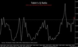 (click to enlarge)
Share Prices Running out of Steam
- Market value of companies is greater than the replacement cost of their assets.
- Tobin’s Q ended the third quarter at 0.98.
- The ratio is based on market and asset values for non-financial companies.
- Readings of more than 1 show stocks are overvalued.
- The fourth-quarter performance of the Standard & Poor’s 500 Index points to a ratio of 1.06.
- The index posted a 7.5 percent gain for the quarter through Dec. 9.
- Valuations are not as cheap as they used to be.
- S&P 500 closed at 16.9 times profit (12.11.13), an increase from 14.2 times when the year started.
- Not a short-term sell signal.
- U.S. economy has shifted toward services & away from manufacturing - more investment in assets.
- The ratio climbed to a high of 1.63 in Q1 2000, when a bull market led by Internet stocks ended.
Chart for Sunday - December 8th - Bull Market
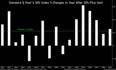 (click to enlarge)
Put That Good Song on Repeat
- This year’s record-setting advance in U.S. stocks points to higher prices next year.
- S&P 500 Index performs well in the year after posting annual gains of more than 20% since WW II.
- The index added 11 percent on average and rose in 14 out of 17 years.
- The S&P 500’s gain for this year amounted to 26 percent as of 12.3.13.
- Stocks are poised to rise in 2014 as long as the economy grows.
- Two of the postwar losses shown in the chart, in 1981 and 1990, occurred as recessions started.
- The other was recorded in 1962, a year after a contraction ended.
- The next bear market will occur when the next recession comes.
- There is a very low probability of the U.S. or worldwide economy shrinking next year.
- Institute for Supply Management’s manufacturing index as an indicator of the economy’s strength.
- The index rose in November to 57.3.
- The latest figure was the highest since April 2011 - readings above 50 signal growth.
Chart(s) for Sunday - December 1st - Deflation
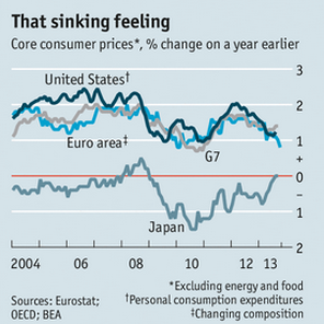
(click to enlarge)
Deflation / Inflation - Balancing Act
- Challenge facing central banks is that inflation is too low.
- Core inflation, excludes food and energy, stuck at 1.2%.
- Asset prices have soared, but consumer prices have not.
- Avg. inflation rate is 1.5%, down from 2.2% in 2012, well below Federal Reserve target of 2%.
- Fed encourages borrowing by reducing the interest rate to below the rate of inflation.
- Goal may be interest rates of 2%-3% below inflation to get economy moving. Impossible now.
- Key - real interest rate = inflation adjusted. Nominal Rates minus Inflation equals Real Rates.
- Ultra-low inflation signals a weak economy and higher than recommended unemployment.
- Nominal wages grow more slowly.
- Current Fed policy - keep rates at rock bottom until unemployment rate falls to 6.5% and inflation is no higher than 2.5%.
- Fed should lower target unemployment rate from 6.5% to under 6% or lower.
- Fed should introduce inflation threshold >1.75% - prices need to rise before interest rates are increased.
- Fed should keep interest rates low even when inflation reaches 2%+, maybe even 3%.
What is Deflation?
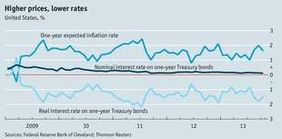
(click to enlarge)
Prices Persistently Fall
- Extremely damaging to a weak economy with high debts - very difficult to escape.
- Loans are fixed in nominal terms, falling wages (consumers) and prices (business) increase the debt payment burden.
- When nominal interest rate is zero, and expected inflation rate is 1%, real rate is -1%.
- Once people expect prices to keep falling, purchases are delayed - economy weakens further.
- Slow growth with high unemployment - deflation inevitable - took Japan 7 years for deflation to occur after their economic meltdown.
- Removes a tool from the kit - quantitative easing and forward guidance will not be as potent.
- Central banks will be moving into more unchartered waters in months to come.
Chart for Sunday - November 24th - Economic Growth
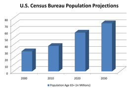
(click to enlarge)
Our Growth Engine is Getting Old
Why we are in for 20 years of lackluster economic growth
Why we are in for 20 years of lackluster economic growth
- As baby boomers retire, less fuel for the economy over the next two decades.
- Boomers started turning 65 in 2011. 10,000 per day, hit 65, for the next 16 years.
- Remaining workers will have less earning power.
- The breaks will be put on consumer spending, currently 70% of GDP.
- Expect growth of about 2% over the next 20 years, down from 3% in the late '90s.
- Retirement rate will be greater than the fill rate of new workers.
- Job gains will be 80,000 per month rather than the 100,000 to 150,000 from earlier estimates.
- Birth rate is slowing to a 14 year low.
- Young families needed to spend on housing, appliances, clothing and more are not materializing.
- Older consumers will not be spending at the rate required to stimulate growth.
- Mean income of Americans peaks at around age 55. Age 70 plus earn 2/3; Age 80 earn 1/2.
- This demographic shift will reduce median income by .5% per year through 2030.
- Income slowdown will compound the recession based stress already put on household budgets.
- Median income is $51,000, down 8.3% from 2007. Poverty rate is 2.5% higher than 2007.
- Minorities will be 35% of the population in 2030. Income is 60% that of whites. Gap will widen.
Chart for Sunday - November 3rd - Social Media
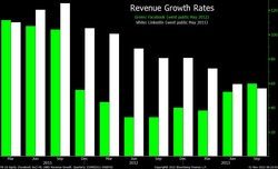
(click to enlarge)
Professional versus Social Media
Facebook Sales Surge Overtakes LinkedIn Growth
Facebook Sales Surge Overtakes LinkedIn Growth
- Facebook went public 18 months ago, less than half the revenue growth of LinkedIn.
- Now it’s ahead.
- LinkedIn had the lead from 2011’s Q2, IPO, through the second quarter of this year.
- LinkedIn revenue rose 56% in Q3, Facebook’s jumped 60 % on greater demand to advertise.
- Facebook’s sales climbed at the fastest rate in two years.
- The pace accelerated from 32% during last year’s Q2, IPO.
- LinkedIn’s revenue rose 89% in the earlier period.
- Last quarter’s reversal occurred as Facebook’s revenue surpassed $2 billion for the first time.
- Facebook took in more than five times LinkedIn’s sales, totaling $393 million.
- LinkedIn ended the quarter with 259 million members.
- There may be another revenue-growth reversal next year.
- Expectations - 2014 sales to rise 35% at Facebook & 42% for LinkedIn.
Chart for Sunday - October 20th - Fast Food Wages

(please click to enlarge)
That Big Mac, Pay at the Counter or Pay through the Government
Fast-Food Wages Come With a $7 Billion Side of Public Assistance
Fast-Food Wages Come With a $7 Billion Side of Public Assistance
- Total cost to American taxpayers of a large, low-wage workforce = average of $7 billion a year
- Median salary of $8.69 an hour and a history of offering only part-time work
- 68% of fast-food workers are single or married adults who aren’t in school
- 26% are raising children
- 52% of families of fast-food workers are enrolled in one or more public assistance programs
- Above as compared to 25% of the workforce as a whole
- Medicaid and the Children’s Health Insurance Program accounted for nearly $4 billion of the $7 billion
- The Earned Income Tax Credit, food stamps, and the Temporary Assistance for Needy Families program accounted for the rest
- Public benefits receipt is the rule, rather than the exception, for this workforce
- McDonald’s, the biggest hamburger chain, received the most public assistance: $1.2 billion worth a year from 2007 to 2011
Chart for Sunday - October 6th - Apple
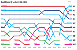
(please click to enlarge)
Nothing Lasts Forever
Apple reigns supreme as most valuable brand
Apple reigns supreme as most valuable brand
- Apple is the most valuable brand in the world
- The previous No. 1 brand, Coca-Cola, fell to No. 3
- Ends Coca-Cola’s 13-year run at the top of Best Global Brands
- Apple was No. 2 last year, climbing from No. 8 in 2011
- Apple brand value is $98.3 billion, up 28 percent from 20
- Coca-Cola brand rose, by 2 percent to $79.2 billion
- Google rose from fourth place last year
- Top 10 Best Global Brands for 2013, five are in technology: Apple; Google; Microsoft, Samsung, Intel
- Samsung - new brand strategy called the Brand Ideal - “a greater focus on social purpose,”
- Apple and Google and Samsung are changing our behavior - changed the way we live our lives
- Facebook, which climbed to 52 from 69 last year, its first year on the list
- BlackBerry, which tumbled last year to 93 from 56 in 2011, has disappeared from the list
- Nokia, which dropped to 19 from 14 in 2011, finished this year in 57th place — the biggest faller
- Addition to the list was Chevrolet, 89, first GM brand to rank among the Best Global Brand
- Value of technology brands rose as they create new ways for people to stay connected virtually
Chart for Sunday - September 22nd - High Cost of Education
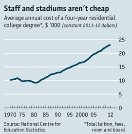
(please click to enlarge)
Value should drive the way we view the World
Bang for your Buck
Bang for your Buck
- Average American graduate completes college with $26,600 in debt
- Proportion of loans in arrears: 8.5% in 2011, 11.7% in 2013
- 2015 - New rating system that measures tuition cost, graduation rate, earning after graduation
- Tie government aid to institutional rating
- Government spends $150 billion a year on student aid (loans)
- Aid is currently doled out based on number of students enrolled
- Current graduation rate is 58% for full time students (earn a degree within 6 years)
- Student loans total $1.2 trillion, 6% of the national debt
- Increasing federal aid leads to minimal increase in attendance
- Most of the cash spent by colleges is in raised fees, increased salaries and building stadiums
- Huge need for cost cutting, but it is up to the colleges to figure it out and implement
Chart for Sunday - September 15th - Bull Market
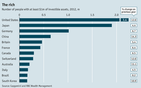
(please click to enlarge)
A Recession that is a Bull for the Rich
The rich get richer
The rich get richer
- 2012 - 12 million people had $1million in invested assets
- Up by 1 million high-net-worth-individuals from 2011
- Combined wealth increased by 10% to a record $46.2 trillion
- Rich people: America 3.4m; Japan 1.9m; Germany 1m
- The above account for half of the world's wealthy
- Of the top 12, only Brazil failed to increase its wealth year over year
- North America proclaims the top slot of all regions, Asia-Pacific certain to dethrone as economies continue to grow at a rapid pace
Chart for Sunday - September 8th - Fast Food Wages
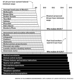
(please click to enlarge)
Welcome to McDonald's, may I get a raise please?
Fast-food workers are looking for wage increases, can the economy support that?
Fast-food workers are looking for wage increases, can the economy support that?
- 3.9 million Americans are now working in the fast food industry
- Typical worker is paid ~ $9 per hour - minimum wage is $7.25
- Burger King & McDonald's are mostly franchise operations
- Company owned outlets have profits > 10%, labor expenses exceed profits
- For wages to go to $15/hr, menu items increase 25%, Big Mac up by $1, consumers bail
- Franchise stores profits < 10% often as low as 2-3%, corporate stores average about 15%
- Franchise payments contribute 33% to 40% of revenue at parent chains
- Employment intended to be for entry level teens and part-time workers
- Do not require skilled workers and the hiring pool is large
- Wages, and increases, tend to track closely with the federal minimum wage
- Minimum wage - Obama wants $9/hr by 2015, Congressional Democrats $10.10
- Any increase will go directly to consumers
Chart for Sunday - September 1st - Baby Boom Economic Impact
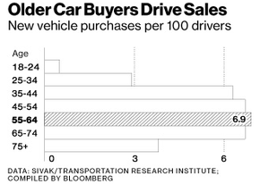
Baby You Can Drive My Car:
Consumers 55 and older have replaced younger people as top purchasers of new autos
Consumers 55 and older have replaced younger people as top purchasers of new autos
- Most likely to buy an new car - 55 to 64 year-old age group - the oldest of the baby boomers
- Four years ago it was the 35 to 44 year-old age group most likely to buy a new vehicle
- Auto industry is spending billions to target Generation Y - ROI better spent on their parents
- Tough economy has extended the working years for baby boomers
- Strong psychological factors in play. Their automobile defines them. A visible expression of you and your personality
- Fewer young people are interested in driving
- In 2011 - 79% of people between 20 and 24 had a driver's license. 1983 is was 92%
- In 2011 - 93% of those aged 60 to 64 had a driver's license. 1983 it was 84%
- Consumers 75 and older bought cars at a higher rate than 18 to 34 year-olds
- Your propensity to buy a vehicle at 25 is 1/4 of what it is at age 65
- Image is everything - Boomers want to stay active and young, and look it too.
- Coming back to Detroit - 1980s saw Boomers shifting to German and Japanese cars
- In 2013 - 22.2% of all vehicles were sold to the 55 to 64 year-old age group
| generational_characteristics.pptx | |
| File Size: | 681 kb |
| File Type: | pptx |
Chart for Sunday - August 25th - Baby Boom Economic Impact
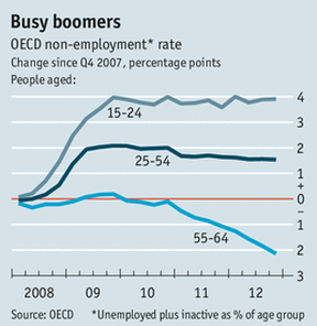
(click to enlarge)
Grey Area:
Older workers have fared well since the Global economic meltdown
Older workers have fared well since the Global economic meltdown
- Recession in rich countries has been intense and recovery has been weak
- Young workers - employers stop hiring them, sack them first
- Older workers doing better than previous recessions where they were the first to be fired
- "non-employment" (unemployment + given up looking)
- 15 to 24 year-olds up 4%
- 25 to 54 year-olds up 1.5%
- 55 to 64 year-olds down by 2%
- Older individuals need to work because of wealth erosion and/or poor investment returns
- A job gained by one person is not a job lost by another
- Young and old do different types of work in different types of occupations
Chart for Sunday - July 7th - Consumer Debt
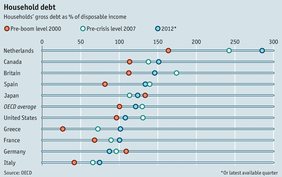
(click to enlarge)
Household Debt:
- Soared in most rich countries prior to the financial crisis
- Exceptions were Germany and Japan - experienced no housing boom and debt accumulation
- Debt to disposable income rose by 30% to 130% between 2000 & 2007
- Currently levels have fallen in US, Britain & Germany, not in France, Italy and the Netherlands
- Property values are still declining in high debt countries
- The Netherlands debt was 285% of disposable income in 2012
- Canadian banks appeared unscathed in the crisis, debt levels now exceed 150%
Chart for Sunday - June 9th - Female Workers
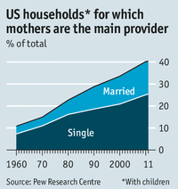
(click to enlarge)
Mothers bringing home the Bacon
What does it show us -
What does it show us -
- 40% of all US households have mothers as the main breadwinners and financial producers
- Most are single parent households
- Biggest increase is in the share of households where wife earns more than the husband
- Currently the case in 15% of households with children
- Median income of these homes is $80,000
- National median income is $57,100 & $23,000 for single mother households
- Since the recession started in 2007, dramatic rise in women who want to work
Chart for Sunday - May 26th - The Great Recession
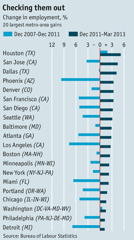
(click to enlarge)
Warmer Climate, first to Recover -
- 1970 - 40% of the population lived in the southern half of the US
- 2000 - greater than 50% now populate the region
- Air conditioning allowed population of south through climate control
- Economic opportunity pulled population to the south
- Demand for housing
- Poor lending standards resulted in reckless borrowing
- Texas had strict rules on predatory lending due to past history
- Dallas and Houston added huge amounts of housing with much upward price pressure
- 2000 to 2007 - values rose 20% to 30% in Denver, Atlanta and Dallas
- Phoenix and Las Vegas prices soared 90%
- Los Angeles, Miami, DC and New York prices doubled
- 2007 to 2011 - San Jose, Austin expanded 14% & 19%
- 2007 to 2011 Las Vegas, Los Angeles, Miami, Phoenix, and Atlanta shrank by 12%
- 2008 - mortgage markets froze
- Metro areas with the highest concentration of weak borrowers hurt the most
- 2011 rapid employment growth
- Household deleveraging, fast foreclosures, quick pain and out; escape deep debts
- New buyers for local houses, new demand for local businesses
- Energy boom in Texas, Oklahoma and Louisiana
- Smaller tech centers see growth
- Population driven growth
- Output and jobs, follow the people; people are moving to the sun belt
Chart for Sunday - January 27th - Government
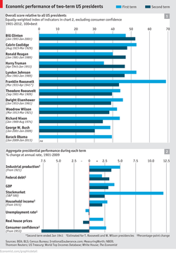
(chart of the week)
Second Term of Two Term Presidents
What does it show us -
But -
What does it show us -
- Looking at the 8 economic indicators in table 2 during the President's second term
- All, except the Federal Debt, have fallen
- Economic performance declines by 4.2% in the second compared to the first term
But -
- Who would have thought that Obama would get reelected with unemployment over 7%
- Next to the Great Depression, we have not been here before
- VIX is at a six year low
- Economic potential can be realized
- Interest rates to remain low through at least 2015
Chart(s) for Sunday - January 20th - Energy
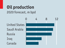
U.S. Oil Self-Sufficiency
What does it show us -
What does it show us -
- Possible self-sufficiency in Natural Gas / Energy by 2035
- World's largest oil producer by 2020 - 11.1 million barrels per day
- Cheap gas = cheap electricity - boost to American industry & economy
- Today, oil imports = 19 million barrels per day @ $95 (Friday) per barrel
- Reduce imports to 3 million barrels per day by 2035
But-
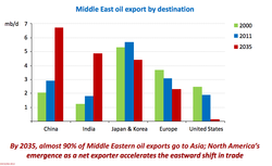
(click to enlarge)
- Requires approval of Keystone XL Pipeline - Canada to the Gulf
- Carbon tax may be necessary to curb demand for 'dirty' energy
- Requires approval to export liquid natural gas, may increase prices at home
- Prices still determined by Global supply and demand - World markets in play
Chart for Sunday - January 6th, 2013 - Gross Domestic Product
Organization for Economic Co-operation and Development - GDP per Capita
What does it show us -
But -
What does it show us -
- Rich economies focus on policy making with priority on recovery.
- Economic and demographic realities churn along in the background - long term.
- Fast gains will occur in underdeveloped countries with large populations.
- Economic power will tilt away from the rich world.
- China & India will make up 46% of the world's GDP.
But -
- Chinese & Indians will have less wealth than Americans.
- GDP for China will be 59% of the U.S.
- India GDP will be 27% of the U.S.
- U.S. will increase its lead over France, Spain, Italy and Greece.
- U.S will stay on par with Germany, Britain and Portugal.

